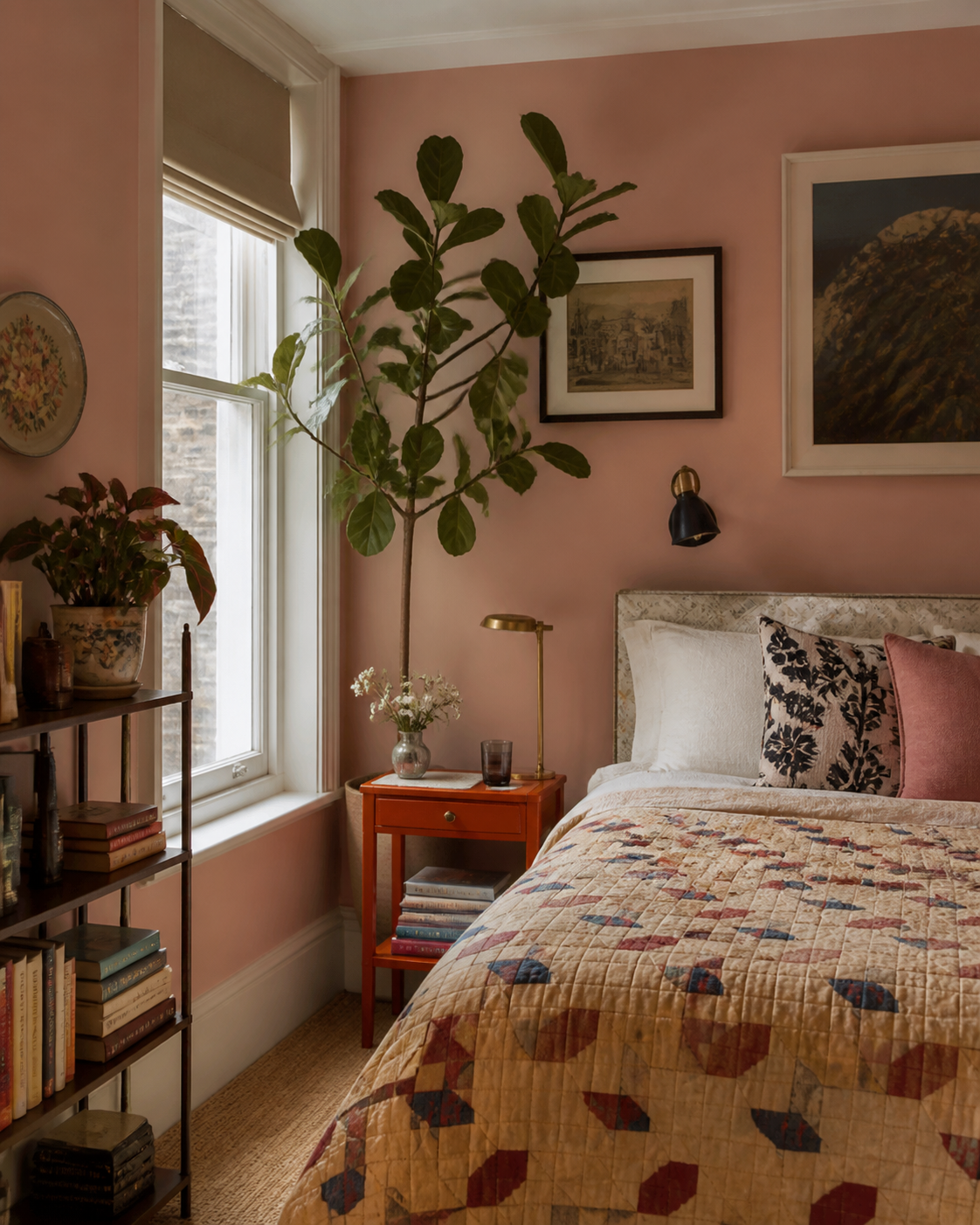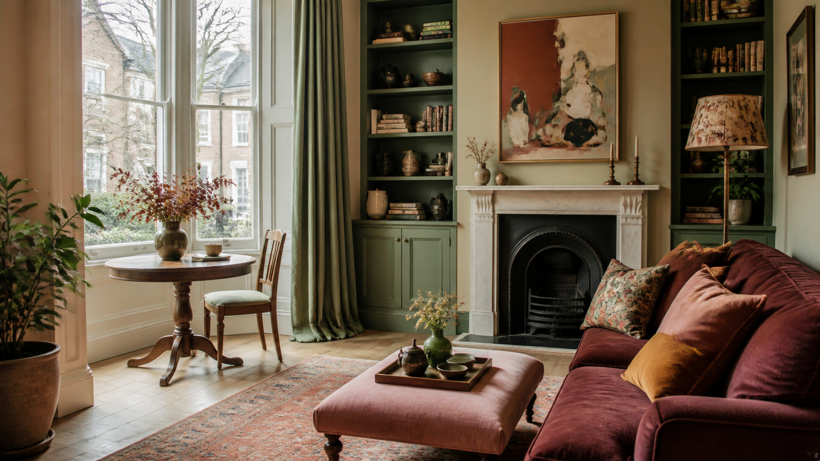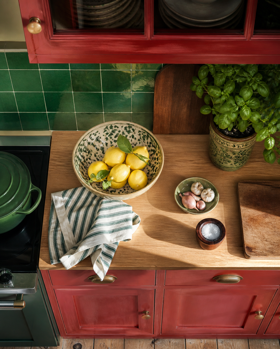
A room with colour does not need to explain itself. It only needs a clear point of view and enough quiet space for the everyday things that make it yours.
Start with the feeling
Before a paint card, name the practical mood you are hoping to create. Do you want the room to hold a busy family day together, soften the first hour at home, or make a tiny corner feel more intentional? That answer gives colour a useful job.
Balance the temperature
One warm note and one cooler, more grounded note tend to keep a scheme from feeling flat. Let the larger surface carry the calmer shade; use the richer one on the parts of the room that deserve to be noticed twice.
Make the bold choice once, then give it room to breathe.
Let the room settle
Repeat a colour in a small, less obvious place: a book spine, a lampshade, a bowl, a curtain edge. The repeat is not a rule. It is simply what lets the room feel composed rather than coordinated.